Friday 13 May 2011
Friday 4 March 2011
Final Evaluation
Below is our final evaluation, I hope you have enjoy watching our music video as much as we did making it. The evaluation speaks for itself so I'll let you watch.
Music Video!!! (Final Cut)
We have finished our music video!
Today is deadline day and we've managed to pull everything together in time. I have been putting in hours of work to edit the video with Stan finishing off the evaluation, which I will post later, we have finally finished everything!
Please feel free to let us know what you think! :)
Hope you've enjoyed everything as much as we have.
Ian
Wednesday 2 March 2011
More Editing (Update)
Just to keep you filled in on whats going on with the project at the moment, as deadline day is now on Friday!! I am putting in many hours to try and get this editing sorted, after Ms Hill was able to mark our drafts over half term she gave me some ways which we could improve our video, this was by using layering, and splitting the clips in to multiple screens. Today I have been trying to complete this, with the help of Ms and a couple of YouTube tutorial videos I have managed to produce what I wanted.
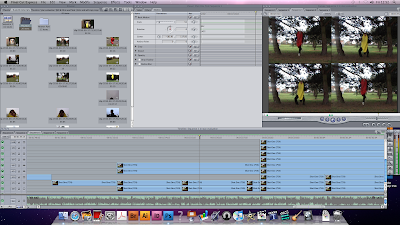
Hopefully you can see from the screenshot above what it looks like, I have created it so that there are four different screens in one. On a certain drum beat these then split again to accommodate our third character and the screen is split into nine screens, three by three.
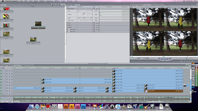
Here is a similar screenshot, I am just trying to show you how I managed the clip splitting. As you can see along the bottom were all the clips are we have multiple layers, which actually goes up to sixteen but you can't see them all. In the viewer screen (top middle) you can see how I shrink the screens, I had to use trial and error to get the right percentage as it wasn't as simple as shrinking them to 25% each. After finding the right percentage I had to find the right co-ordinates for each of the screens so that the effect would work right.
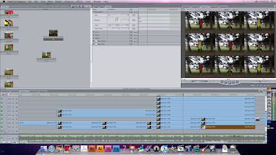
Here is the final screenshot, as you can see this is the final scene for this shot and I have managed to divide the screen into nine, after lots of tedious editing I have completed what I wanted to do. I will do this similar technique again somewhere else in our music video as I think it's a really effective technique to use and it that it really fits our type of video.
Ian
Wednesday 23 February 2011
Textual Analysis of previous student work
This music viedo produced by A2 students is very different to the previous student work i analysed and of our music video, which is why i have found this one the most interesting.
Their use of black and white is more effective because the video is set at night time which helped emphasise on the atmosphere that the students wanted to create. the night setting fits well with the song choice, because chase and status music is known to be very high tempo because its techno based music, therfore a lot of connontations of booze, nightlife and drugs is related in their videos which the student has played with. the settings have been well thought through also because they have kept it rural, similar to the style of music which chase and status produce, therefore they have made the effort to film in rural areas to make the video dangerous and not simple.
the camera work is very good, they use alot of variation of shots to help keep the video fast paced in parts and to play with certain moods of the character in the video, for example when the character is drunk the shots are hand held to make it seem beleievable, when hes angry the shots are straight cuts to help pick up the pace. This clearly shows that they have thought about alot of stuff to fit in the video to make it work with the song and make it realistic.
editing in this video is noted because they use alot of transitions such as black to white to connote the charcters state of minds change, which was very effective. they keep the character stable at the beginning whilst the cars and buses were sped up which was also very effective, its quite similar to Michel Gondrys work because he is a huge influence on others who produce videos such as A2 level students by using objects and props to symbolise beats to a song which these students have used similarly. They similarly at one point split the screen into four parts gradually to also connote seperate beats which i found quite clever. Lastly another good element of editing i liked was the green effect when the character in the video pushes the kid at the cash machine, this clearly connotes that he is drunk, however the students have used something different to show hes drunk instead of repeating the handheld camera scene. this shows they have used great amounts of variation. overall alot of editing has been done which has successfully helped make their video very good.
the lip syncing was very good too especially as the lyrics are said very fast therefore alot of time and effort would have been done to get it precise. i thoroughly enjoyed this video and was very interesting to watch a differnt genre to indie style music. i found it very influential and well thought through.
Textual Analysis of previous student work
This music video was created by students who were also filming for their A2 media coursework, it was great to watch other students who have used similar resources as us and have produced a well panned narrative based music video. the song "Mardy Bum"found on the album "Whatever People Say I Am, That's What I'm Not" a well known song by the Arctic Monkeys, which has probably a high influence on the students as the Arctic Monkeys are a very succesful band originated from sheffield.
i found the narrative fitted well with the song choice which fits well with the idea of comparing lyrics to narrative, a good analyse of one of goodwins 6. This helped the students make the music video make sense to their audience as alot of Arctic Monkeys songs have narrative and performance based videos such as "when the sun goes down" which is a brilliant example of one of the Arctic Mokeys best narrative music videos.
The students lip syncs are very precise to the music which always makes a A2 music video believeable because there is nothing worse when the music doesnt fit the performers lips movement. The imprevisors of the Arctic Monkeys in the students video are very good too because they share the same characteristics as do the Arctic Monkeys which shows they have clearly analysed the techniques to make their video fit the genre music the Arctic Monkeys produce.
they chose to keep their video basic by using black and white all the way through. This keeps the lighting minimalistic because i didnt find there was any diffence in the lighting by using it, however it was quite effective when the two boys are running down an alley way as the black and white helped make it look dindgy and dark, but i think they could of improved by using more lighting on the performace parts just to show emphasis on their significance to the video, similarly to other music videos that are produceded on the likes of MTV.
their camerawork was good especially when they used straight cuts of the performers playing the instruments, to fit with the beat i found that very effective. On the other hand i think they could of used more close up shots on parts such as the girl in the kitchen because she was obviously a lyric related part of the video, therefore as the audience we wanted a closer view, or they could of made it more effective by not seeing her face because it leads more to the imagination in my eye, because i did think it made the video too choreographed.
the setting was good especially in the alley way because the Arctic Monkeys are known to using very rural areas, this shows that their influence helped the students with their work. however where the students performed as a band i got the impression they were performing in a class room which spoilt the video because they kept it simple without going to any effort on finding somewhere out of their depths.
overall i found the video good because i know that it would have taken alot of practice by those who mined the lyrics and learning the instruments, therefore effort was visible in the video. There are though a few adjusments i would make just to help keep it realistic and believable. I have found this helpful because i have looked at our video from certain points at a different perspective to change parts that could help make it better, however i think the choice of song for our music video can get away with unrealism as our song choice is very enthusiastic whereas this particular song is very rustic.
Textual Analysis of "brainstorm" by Arctic Monkeys
This Muisc Video uses alot of elements for a successful music video for the audiences eye. The use of colours to make parts of the video to stand out is very similar to what our group wanted to create in our music video.
Mes en Scene: each member of the band looks the part of the genre music they're performing, Indie. This creates a good look to the music that they're playing to provide their target audience with an influential look, which is very modern in todays fashion. The women dancers are wearing very basic clothing which reveals alot within the movements they're doing in the dance routine which is a good use of goodwin 6, an eye for the female body, this is a big factor on most music videos, however what i found most interesting was that you dont see oftenly female bodies or even provogative dancing because its more seen in R'n'B music therfore by using it in a different genre it makes the video stand out to the other indie style music videos. The dancers represent the musics beats, because if you watch carefully you can see their movements respond to the musics rhytm which aids the movement of the music video by becoming fast paced. Another interesting part in this video is that the settings used are very strange and obscure which is very effective for the upbeat rhythm of the music, in my opinion i get this feel of an asylym as though wherever you go you cant escape the "brainstorm" that is being created by the bands music.
the Arctic Monkeys are a very popular band and the goodwin 6 element of high performance levels of the band playing, is very important. by the band performing in their video it provides a huge influence on the audience for those who look up to them and also the audience want that notion to see the performers play because it creates an atmosphere like a concert does.
camera work: there is a lot of close up shots especially on parts where the band is playing, this is effective so that the audience get some form of involvement in the music. at the beginning of the video there is a shot where parts of the picture is cut out into a hectagon shape, this creates an immediate edgy feel to the video straight away, indicating that the video is going to be an indie genre because all that the hectagon shape holds is the band waiting to perform.
editing: the edits used are very obvious, they use alot of straight cuts to keep the video fast paced, it also fits well with the music because its fast paced and every time a new beat is audible the cut changes to another. This helps makes the video flow, even though clips are chopped into sectors whilst being intwined with other clips. This appears strange however, it does work because it relates really well to the title of the song and for its conceptive factor. Another edit used in the video is the great use of animation, especially of the womans mouth, where you see the movement under neath the muscle and skin, this would have required alot of effort and work, which makes the video become one of them high technified succesful videos.
Lighting: the lighting changes drastically through out the video, similarly to the cuts. they use a great amount of colour when the women dancers are performing, this makes them stand out because they're significance is big in the video because 1) they are unusual for their style of music 2) they represent the beat and the colour change helps represent the beats importance to their movement and 3) the colour is a huge comparison to the light used when the band play which is a bright light. the white light connotes their power and significance in the video as they are the high performers the "stars" and therfore the white light is their stardom and success.
Saturday 19 February 2011
Evaluation
Last week we finished the rough cut of our evaluation. The main content of the evaluation, (answers to all of the questions) have been filmed, uploaded and edited, but a few design aspects will need to be changed before the piece can be called finished. We also need to add some outside material, such as a youtube video and various screenshots, that will be placed at the relevant places in the evaluation.
The final piece is somewhere between 5-6 minutes and goes into depth in answering questions about the production of our music video and ancillary tasks. It is formatted in the style of all the members of our group answering one of the questions, along with various clips from the music video and of the editing process, as well as pictures and screenshots layered over the top, much like a voice-over.
The evaluation also includes a backing track (Vampire Weekend's 'Giving Up The Gun'), which I think adds a slightly more atmospheric and professional quality, as well as sounding good and relating to the work we have already done.
After leaving ourselves with little time to produce the evaluation, I am pleased with what we have produced. I feel the style in which we have created the piece has worked very well, as it comes across as professional yet informal, while managing to avoid being dull and repetitive, which was an important objective.
Thursday 17 February 2011
The Final Touches
We are now in the process of finishing off our music video and evaluation. It wasn't long ago when we were filming our evaluation.
We all felt that the filming went well and all the answers (written by Stan) worked equally as well. During filming, every member of the group took up the challenge of answering a question on camera, and all were successful.
The editing of the evaluation and the music video have been the main focus over the last few days, as opposed to the digipak and website development. We really want to perfect the moving image side of our portfolio.
Now that we are coming to the final stages of the project, we are starting to look at our production from an audience's point of view and we feel it is very entertaining.
We are very excited about the final product.
Website
Here is a link to our website!
http://www.wix.com/stanevans93/vampire-weekend
I feel I have managed to create a website that directly promotes our own project without straying beyond the boudaries of a professional and authentic band website. I think the key to this was finding a balance between linking the website directly to our own work, while maintaining a realistic and believable feel within the website.
The website contains a mix between official band pictures (such as promotional photo shoot pictures and live performances) and some of our own work (digipak covers that we produced on Photoshop and screenshots from our music video).
While trying to stick to various conventions used in the official Vampire Weekend website, I tried to give the website it's own identity, in the sense that I moved away from the official fonts, and employed a plain black background (which is an effect that we have also used with out digipak).
I found Wix an extremely useful programme, and it made the whole process a lot easier than I had anticipated, and I feel that it has enabled me to produce a website that we are all very pleased with.
Wednesday 16 February 2011
Audience Feedback (Editing)
A key way to producing a great/loveable music video is to take advice from people, especially those who fall into your target audience. On Tuesday we had 5 participants come in and want our (unfinished) video. After watching the video we had lots of positive comments. Particularly on the concept of out video which was really pleasing as we had received some critical feedback from others on this front before hand.
We also had some, constructive criticism which can help us, one recommendation that was all agreed on by the audience was that it needed more effects. (To go with the catchy beat of the song) Later on I managed to complete some editing and re-called the participants back to asked them what they thought of the new idea and they loved it!
Below are some screenshots of what I have created.


As you can see from careful observation I had to be perfect on getting the right amount of colour control on each dial, I chose that 0.5 and 0.54 were the magic numbers for me. I was basically reversing the colours each time the shot changed on the edit.
Using this audience feedback as given us a massive confidence boost as we now know that we are pleasing our target audiences!
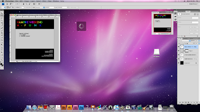
Digipak (Back)
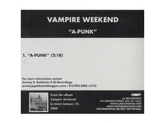
A back panel of a digipak or CD case will have certain features that we can also apply. Below is a copy from the back of Vampire Weekend's A-Punk CD case, when I create the back cover I will base my ideas on this template.
 After a long day on Photoshop (PS) I have created the back cover that I wanted for the Digipak. Using the original copy of the Vampire Weekend CD back to inspire me I have created a similar and more, what I think is simplistic version.
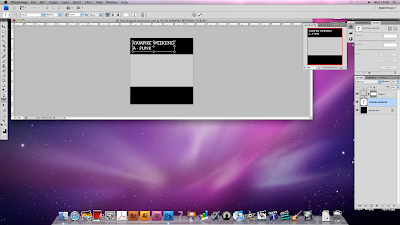
This is the start of the back for our Digipak, similar to the original copy, I have created a black background with a grey rectangle covering the majority of the middle section of the back. Along the time I have label the Digipak with the artist's name and the song name. I will go on to fill each individual letter with colour, as I did on the front.
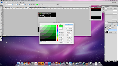
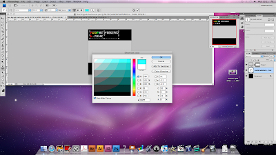
Here you can see me adding colour to each letter, it is quite a simple task once you know how. I had to be sure to get the same mix of colours that were on the front cover to maintain professionalism. This is just one of the MANY skills I have acquired throughout this production.
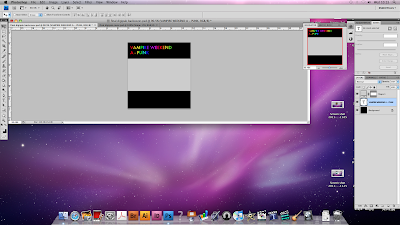
This is the back copy now having finished the lettering.

To add a finishing touch to the lettering I decided to spread out the A-PUNK letters to cover up more space and therefore match the VAMPIRE WEEKEND in length. I got this idea from a Radiohead album that I own, "In Rainbows" which uses this technique on the back and I think it's really cool.
After finishing the lettering I moved onto adding some extra information to the back, in the bottom right corner I add some details about the song which I got from Wikipedia. This gives it a more professional look. I also added a track listing to the back as this is a standard convention of any CD or Digipak. I added an extra song as singles will always have an extra song, even if it is a single about one song like it is for us.
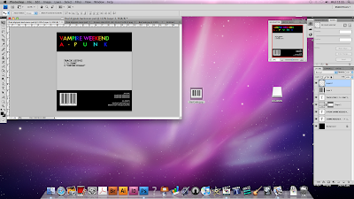
Added a barcode to the back was the last thing I did today. This just gives it a more authentic and professional feeling. I copied the barcode of Google Images and pasted it into PS then re-scaled it.
One thing I may change... Is that I feel there is wasted space on the right hand side of the pack. I had an idea to add pictures of the actors in their costumes on here but I'm not convinced it would look good yet. So tomorrow I will do this and decide whether I will keep it on or not. Either way I will blog about my decision.
Ian
Evaluation
Today we filmed our evaluation which went really well. Firstly Stan wrote out the answers to the four set questions we were given, Stan then took the time to write everybodys input and efforts through out the making video process which we then explored the negatives and mostly positive moments when making our music video. we made sure that the questions we talked about in our evaluation were in great detail so that when people come to watch the video they can get involved and find out how we went about designing the digipak, the editing and the shots used in the video. we wanted to make sure that our target audience will get the most of our evaluation so that they enjoy our work equally to our enjoyment making it.
Subscribe to:
Posts (Atom)